More Words Less Pictures Edition
Or, the “I’m much better at writing than I am at taking photos” edition
Ideas, Schmideas…
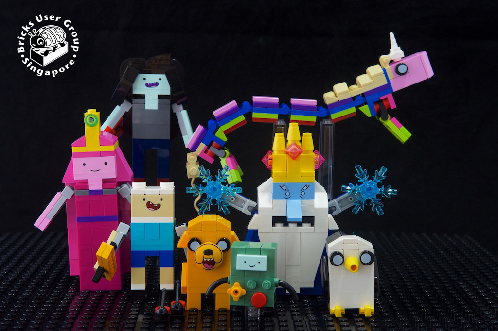
I’ll admit, I’m not the biggest fan of the Ideas theme. While I get that it’s a democratic process where fans are given the chance to vote for the Ideas they would most like to see turned into actual Lego sets, most of the sets that actually make it to production mean little to me. There are some (in my opinion of course) hits – the Curiosity Rover and the Big Bang Theory diorama come to mind – but I had to look up Adventure Time and Voltron to even figure out what they are. And don’t even get me started about Minecraft…
Then, Ship In A Bottle, The Flagship Leviathan was announced as having made it through the review process. Whoaaaaa! Even the name sounds cool.
A Ship in a Bottle?
If I may digress a little. A “ship in a bottle” is probably the most common variant of the “impossible bottle” puzzle, where the bottle contains an object which does not seem like it fits through the bottle’s mouth (no, bonsai kittens don’t count). In days of yore these apparently were popular maritime-themed gifts, perhaps given to ship captains on the occasion of the launch or christening of their new ship. There are two common methods of creating a regular – as opposed to Lego – ship in a bottle. The first, and arguably easier, method is to construct the ship such that it fits through the mouth of the bottle, and then raising the mast and unfurling the sails and rigging after the ship has been placed inside the bottle. The second method is much more challenging, and involves painstakingly constructing the ship after the parts have been placed inside the bottle, through specialized tools which reach in through the mouth of the bottle.
I briefly considered utilizing the second method for the purposes of this review (because art!) but decided against it because the set would probably be out of production by the time I managed to finish building.
Some Caveats
Most importantly, I don’t really follow Ideas in much detail. I have no idea what the original fan submission looked like, so I am unable to compare the original and the actual set. So this review is solely based on the set I have on hand.
Also, as I mentioned at the top of the page, taking photographs is not my forte, besides you can find plenty of pictures of the set, from all angles, taken by people who actually take photographs for a living, on the Internet. Though I did include some on here, just to prove I actually built the set..
Anyway, enough preamble. On to the review.
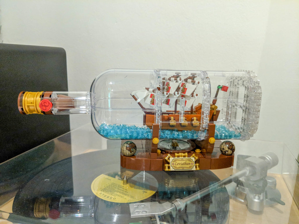
The Flagship Leviathan
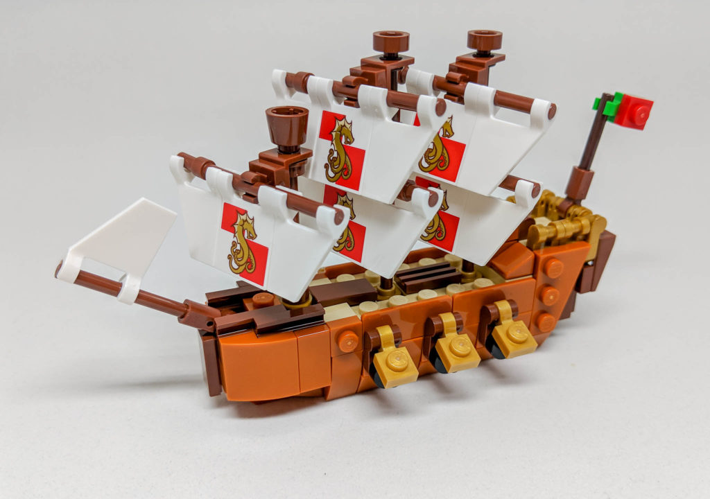
I am a big, big fan of microscale Lego. I love looking at microscale builds of all sorts, marveling at the multitude of innovative, and often mind-boggling, ways builders have repurposed parts into their creations. The Flagship Leviathan is full of interesting examples, and this to me is the standout feature of the build. My absolute favorite is the use of the 1 x 1 round tile with bar as tiny little cannons, together with the 1 x 1 clip as the gun port. I also particularly liked the use of an inverted cone as the crow’s nest, and the new-fangled 1 x 1 modified round plate with handle (is it just me or does this part seems to be in every new set these days!) as the railings on the quarterdeck. Oh, and the reddish brown slopes with slots on the stern? Genius!

The SNOT work is also generally impressive, with clever use of 1 x 2 plates with rails and 1 x 3 x 1 panels to add some detail to the deck. Though on that point, in my opinion visible studs should be avoided if at all possible, so perhaps some more reddish brown 1 x 2 tiles with grilles could have been used to cover up the tan studs on the main deck. But that is a personal preference more than anything and does not detract from the elegance of the build.

Overall, a very strong build, coming together very nicely, with loads of small details to be appreciated. If I could nitpick, one flaw would be that the sails seem a tad too crowded, and could be spaced out better. And that seahorse(dragon?)-octopus(?!?) flag emblem is quite frankly bizarre, though I guess it might strike fear into the hearts of sailors on an opponent’s ship in a 1850s-or-thereabouts naval battle.
As an aside, the miniature pirate ship from 60 Years of the Lego Brick cannot hold a candle to this build. They are both miniature Lego ships, the similarities end there. The Flagship Leviathan is far superior in almost every way, except perhaps nostalgia factor.
The Bottle

This is by far the poorest part of the build, though I suspect the deficiency is more due to the medium than any faults in the design. To put it simply, Lego is not quite well suited to making transparent, or clear, objects at scale, because there are way too many seams. The bottom of the bottle in particular is a mess of 1 x 1 headlight bricks interspersed with 1 x 2 plates, with cheese slopes doing a very poor effort at simulating curves. AND THERE ARE EXPOSED STUDS!! WHAT BLASPHEMY IS THIS!!
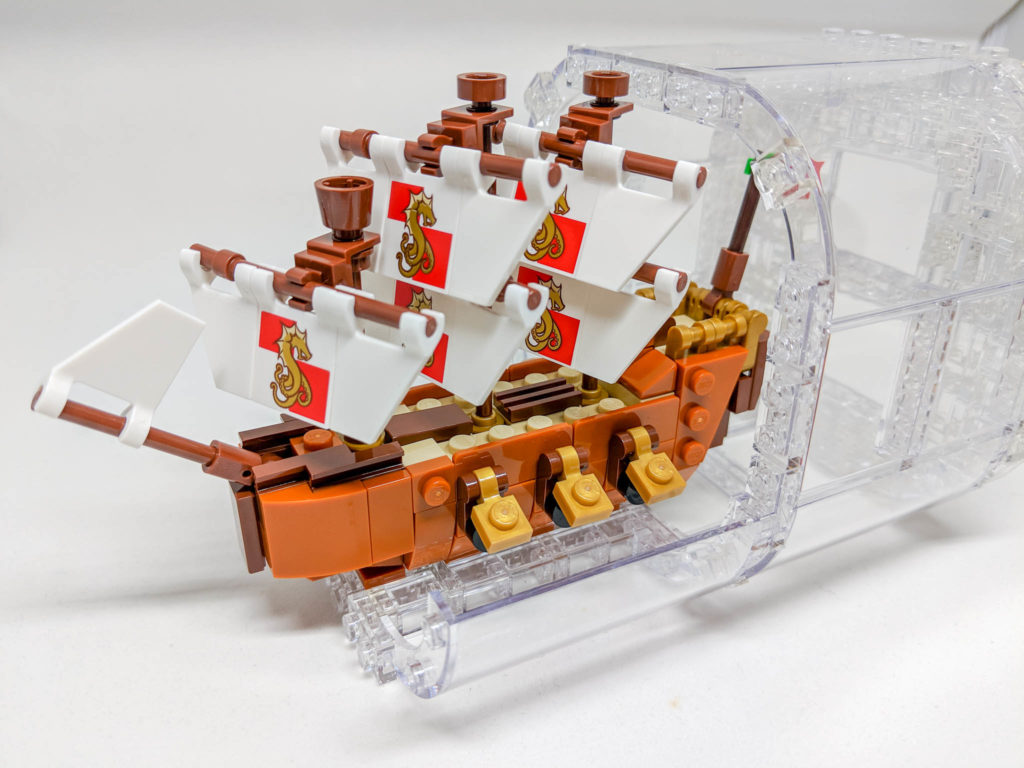
The main body is better, if only the use of larger panels make the seams less obvious to the casual observer. The use of 1 x 1 plates to join the curved panels is also odd, with the angular corners of the 1 x 1 plates protruding ever so slightly from the body of the bottle. I would have thought 1 x 1 round plates would have worked much, much better and would be an easy alternative choice in this case. If memory serves 1 x 1 round plates have also been used in numerous other sets where the same curved panel is featured.

On the other hand, I quite like neck and the stopper. By the time we get to the neck the build is much cleaner, with 4 trans-clear convex panels tapering the body of the bottle towards the mouth. The stopper also includes a very clever use of a pearl gold wheel rim as the foil (I think? The bit you peel away before opening a bottle of wine?) and as the finishing touch, a red 2 x 2 round tile bearing a wax seal with stylized initials. According to the Internet, the initials are the initials of the Lego designer but not the original fan submitter which is a bit of a faux pas in my book, but let’s just leave it there.

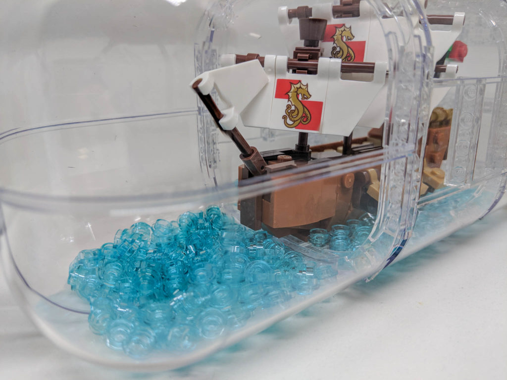
Trans-blue 1 x 1 round plates (according to the instruction manual, 284 of them, though I will admit to not counting and just dumping all I had in as instructed) make up some water, which works well. Some shaking is involved to get the plates to even ought, and I might add a tad bit more to fill up the bottom a little bit, but again that’s just a minor quibble.
The Stand
Some clever SNOT work and an inverted radar dish form the centerpiece of the stand, a compass. The printing on the radar dish is very nice. While the needle is free spinning, the compass is unfortunately non-functional. Would have been a cool touch, and we have seen magnets included in Lego before, but oh well.
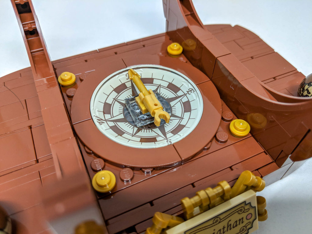
The main body of the stand is quite well rounded out, and is also rather sturdy, and forms a stable stand for the bottle. The half arches matches the contours of the bottle. Unfortunately when the ship is placed on the stand most of the compass is hidden from view.
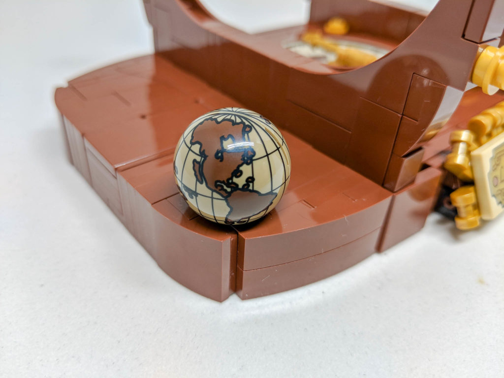
A dark purple minifig head hides within each of the two globes at either end of the stand. The globes are very nice printed parts, though not new. On the other hand, I can only conclude that the introduction of a dark purple minifig head (new for 2018, and as opposed to any other color) is a favour to monochrome minifig collectors, which is a nice touch.

A name plate with “Leviathan” and two stylised coils of rope complete the stand, with some additional decoration provided by artfully arranged 1 x 1 modified round plate with handle in pearl gold (see early comment about the new-found ubiquity of this part!).

Random Other Closing Thoughts
Is it just me, or is the clutch power of trans-clear parts higher than regular parts? They even make a slight squeak from time to time.
Dark Turquoise? Really? I know it’s a new color (well, re-introduced) for 2018, but all the dark turquoise parts are actually invisible, so not quite sure what purpose they serve..
NO STICKERS!!! I know this is par for the course for Ideas sets (with the exception of the Old Fishing Store I think), but it’s refreshing to have to build without worrying about sticker placement.
Conclusion

If it weren’t already clear, I like this set. Quite a fair bit. It may possibly be my favourite Ideas set so far. Then again I have a weakness for microscale, so YMMV. All in all though, a very strong addition to the Ideas line.
Many thanks to AFOL Relations & Programs, LCE Team for the opportunity to review the set.